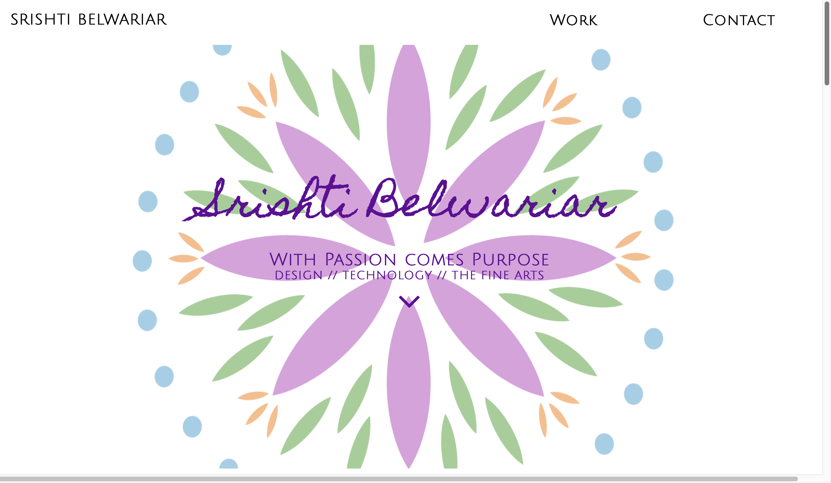
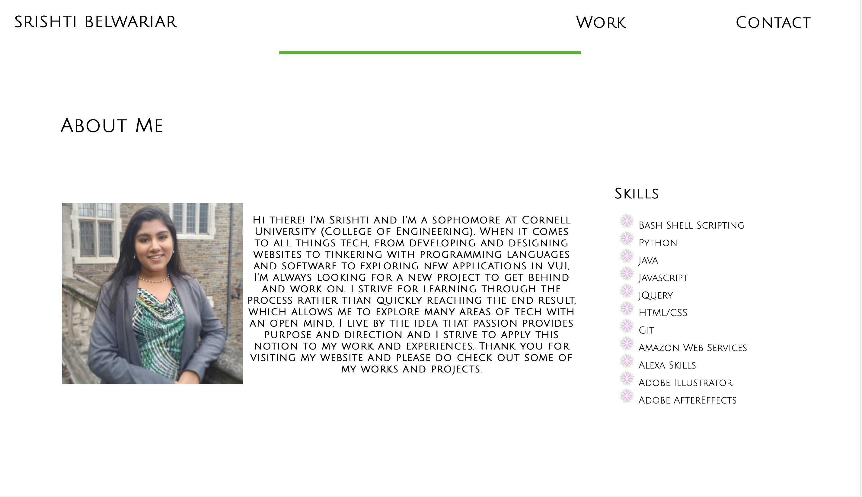
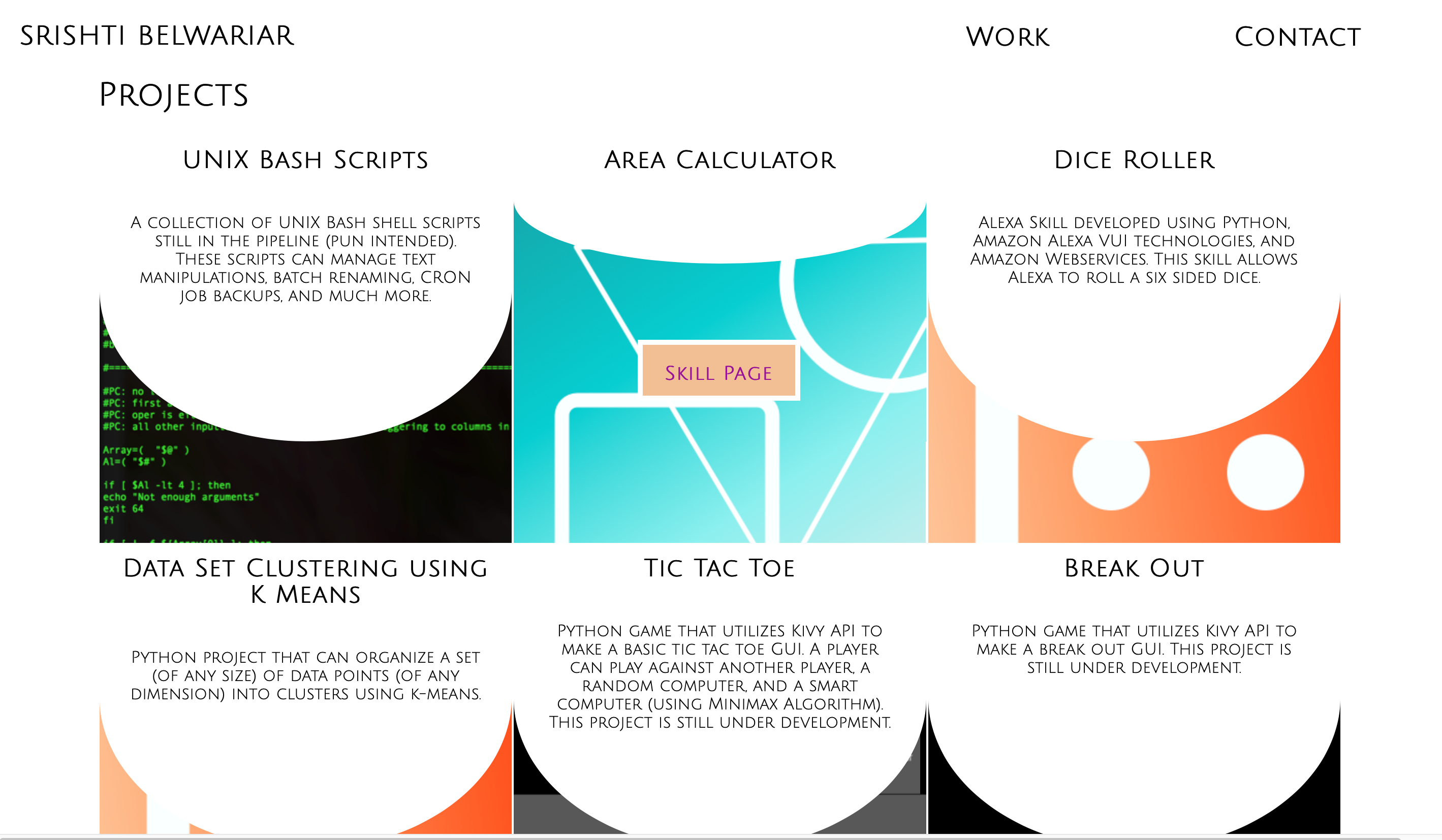
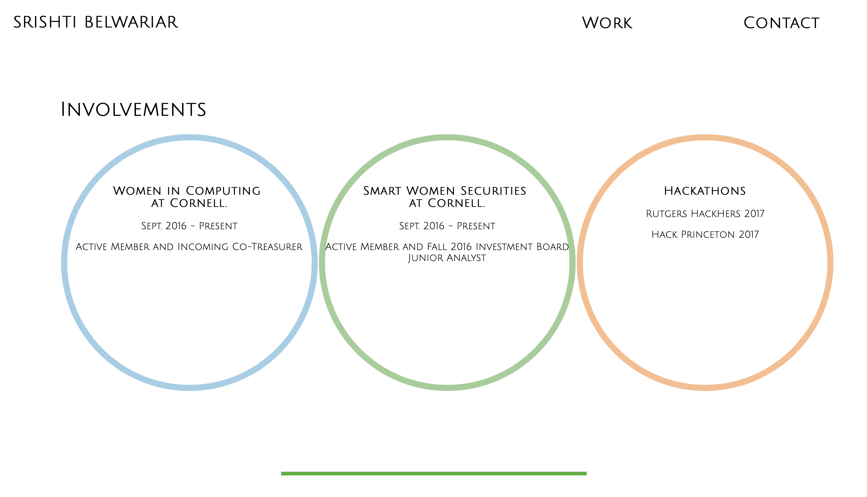
As the stress of second prelims and approaching finals kick in, I do what any college student would do: procrastinate. But, rather than procrastinating with TV shows, I decided to pull up my old website that I had developed my freshman year in college. And, rather than having a bittersweet moment going through my old site, this walk down memory lane felt different. Something I associated as a piece of my past was actually still acted as a live represenation my present. An inaccurate one at that.
No longer did my portfolio share my brand or even highlight my strengths in the way I changed over the last couple of years. This website wasn't some old photograph stashed in an album somewhere or a tattered page from a diary- it was a live site that supposedly represented me. I needed to change this and because I had already accepted procrastination, a little more time spent wouldn't hurt.
|
Pros
|
Cons
|


Although there were a few points that needed to be changed, this projected provided the opportunity to do a complete overhaul of the website to make it what it is today. This website is always changing and developing just like my personal brand, but it better captures how much my brand and skillset has changed. These changes also extended towards changing the content included in the site. Rather than having redundant and uncategorized information across my Github, LinkedIn, and website like the previous version did, I decided it would be best to include key highlights of my work and separating them (using the "B-side" page) based on whether they fit my professional and personal brands.
Additionally, though I did change the color scheme, layout, organization, and content of my website, I did try to retain some key elements from my previous website. For example, the header of the original website had my name in a handwritten font style to add a personal touch to my online presence. To retain this, I developed a cursive logo of my name that would be a part of every frame of the website, rather than just the header.
Because branding is dynamic, it can often be difficult to consider factors on what are necessary components to tinclude or disregard. However, just like how brand changes, this website will continue to evolve over time and take shape as a better representation of my online presence as I continue to learn more and gain more experiences.